• Bug
  • New time tracking UI - Timer edits are overwritten/reset

I don't think this should be marked solved.

when I'm using it in my tablet it looks like this:

Where I'm unable to even see the time.


and on my phone it takes up a lot of screen real-estate:
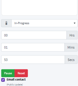

I think we should go with something that is compatible with most standard screen sizes, and won't take up so much screen real-estate

πŸ™

I think we should also add a top-nav hourglass icon with a red number batch with the count of currently running tickets
Like this:

And when clicking on it, this should pop up:

This would help with keeping good track of all tickets running and managing them

maybe it looks a little bulky here but…. you got the idea.. yea?

πŸ™

Very Interesting Idea and nice mockup sounds like we can maybe make this a thing

I may be biased as I implemented the initial time tracking UI but I feel like we've taken a very simple concept and made it really overly complex.

    wrongecho I'm not seeing it getting complex, rather I see it getting more enhanced from an end-user perspective.

    Thank you guys for your amazing work!

    πŸ™

      Bigbug I love your solution, and I agree with the rationale. If we find a less "clunky way" to implement this, we should then release an update. It would be simple to add that, I just need to resetup my dev env.

      @Bigbug Im going to leave it at that. I think someone better at javascript can take it further, or if we ever add it to the database…

      I want to add it server side eventually, but for now she works. And I'm content with that.

      @johnny

      Your most recent updates broke time tracking. It now alerts of incorrect input validation on the hours field and does not save the recorded time.

        I think we should put them all in one box. why 3 boxes?

        I think everyone knows the standard time format of HH:MM:SS

        and also swap the Start/Stop button with Icons

        πŸ™

          Bigbug

          I think we should put them all in one box. why 3 boxes?

          We've now come full circle on the time tracking UI..

          @wrongecho Exactly what I was thinking.

          @Bigbug In a future update, I propose we go back to one field. But only after we have some sort of alternate entry method. I also prefer the icons.

          I dont know, I think we can go in circles on this. But, what we all agree on is it needs work. We have met the usability criteria for my company, and that is the only reason I was putting dev resources into it. From now on I will be focusing on other criteria, and related things for 1.0.

          Well if everyone agrees with the one textbox I am onboard with it as it does take up alot less space then 3 text boxes

          I went to 3 as it increases usability on mobile, especially when it was 3 on top of eachother. Im fine with one textbox, but I would want Javascript buttons to manually change the time. 'Windows time editing" -esqe

          6 days later

          I think you should make the "hourglass" look exactly the same as the notifications "bell" and when there is no running tickets the "0" shouldn't appear.

          Also the red badge doesn't always appear behind the number and it's also quite far to the right.

          Also I think it makes sense to put the actual ticket number for example "TCK-231456" and not the system internal ID for example here "11"

          Also the clients name should appear for better recognition

          And change the wording from "open ticket" to "running tickets"

          Thanks πŸ™